


If your photos look smoky on one screen and neon on another, you are not broken. Your monitor is guessing. The fix is simpler than it sounds and cheaper than you fear. A calm routine, a few free tools, and five careful minutes can make the picture on your desk match the picture in your head.
Monitors ship bright and punchy because that sells on a showroom wall. Real work needs truth, not drama. When tones are right, you edit faster and trust what you see. Designers match brand swatches. Even gamers benefit from cleaner shadow detail. The core idea is simple: set the panel to a neutral baseline and save that state so your system uses it every day. Do that, and color accuracy stops wobbling.
Stray light fools judgment. Sit perpendicular to windows, avoid direct sun, and place a soft lamp behind the display. Give the panel ten minutes to warm up.
Use the built in tools on your operating system. A hardware calibrator is faster and repeatable, but a careful manual pass is miles better than factory defaults. Recalibrate monthly or after a room change.
Ambient light shapes perception. A small lamp behind the monitor reduces eye strain and anchors blacks. Now approach brightness settings like a dimmer, not a spotlight. Most monitors ship too bright. Drop the level until white looks like paper, not a flashlight. Aim for comfortable reading. Then set contrast so deep shadows and bright highlights both show detail.
First brightness, then contrast, then color balance. If your monitor has color temperature presets, start at 6500K and adjust from there. Keep notes so the next session goes faster.
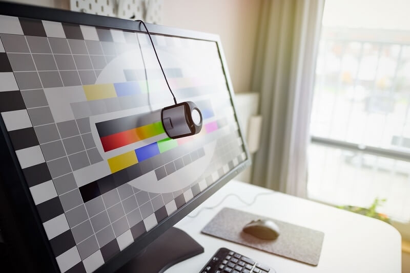
Open a grayscale ramp and a color bars image. Use them like a ruler for your eyes. The ramp should show smooth steps from deep black to clean white. If the bottom steps crush together, black point is too low. If the top steps vanish, highlights are clipping. Tweak until the staircase looks even. This is calibration in action, human and practical.
Two quick reminders help:
If you juggle two displays, match them side by side with the same test images. Close is enough for daily work.
Editing portraits? Make friends with subtlety. Skintones punish heavy hands. Use a neutral reference image and a saturated sample to check both patience and punch. For video, confirm motion looks clean at your chosen refresh rate, then store a neutral preset. Web designers should test in sRGB and keep accessibility contrast in view. Work flows faster once color is stable. Stable color accuracy saves retouches.
Photographers who print benefit from paper white previewing. A slightly dimmer screen makes soft proofing feel honest. If you use a laptop, add a stand and a bigger panel when you build a serious photo editing setup.
Profiles are tiny maps that tell the system how your monitor behaves. Name them by date and panel so you can roll back if something feels off. If you share a desk, store a daytime profile and an evening profile. Switch with two clicks rather than wrestling menus. Consistency beats perfection because consistency is the thing you can actually repeat.
If your apps support color management, set them to respect the active profile. That keeps your display tuning consistent across apps.
Most complaints start and end with light. Too bright and you chase contrast. Too dark and everything looks flat. Here is a trick. Open a favorite photo with tricky highlights and deep shadows. Adjust brightness settings until both ends show detail without glare or mush. Step away for five minutes and return. If it still looks balanced, you are there.
Laptop users should learn the function keys for quick nudges. Daylight on a train is not a studio. Accept the swing, then recalibrate at your desk later.
Cropped UI elements, fuzzy type, colors that feel off by a hair. Little annoyances like these are fixable. Start with sharpness at default; over sharp looks crispy and fake. Next, use OS level scaling for text size. Finally, align the panel angle to reduce vertical color shift. That simple fix adds up to comfort.
External monitors deserve a quick mechanical check. Tighten the stand, raise the center to eye level, and center the keyboard to your body.
You can make strong work without a fancy studio. The secret is repeatable habits. Pick one neutral desk light and leave it alone. Calibrate on the same day each month. Store profiles neatly. When budget allows, add a hardware calibrator for speed and consistency. Until then, use test images and trust your eyes. A tidy, humble editing setup beats a chaotic expensive one every day.
If you care about smooth gradients in illustration, consider a 10 bit capable monitor and a GPU that supports it. Keep cables short and quality high.
Blacks look washed? Room light is too strong. Add bias lighting and lower brightness. Colors look radioactive online? You edited in a wide gamut space and exported wrong. Convert to sRGB for web work. Banding in highlights? Check the cable, then the output color depth. One weak link upstream can undo your careful screen adjustment, so trace the chain before you blame the panel.
Monitors age. If a panel stops holding calibration, it might be time for an upgrade. Look for honest specs and an adjustable stand.
Power on and warm up. Kill reflections. Set brightness to comfortable. Load your latest profile. Test with two images. Edit, trust, smile. It is short, realistic, and gets you back to the work you meant to finish in the first place.
Perfect is a myth. Consistent is the goal. With a few tools and calm repetitions, monitor calibration becomes a five minute habit that pays you back daily.
This content was created by AI